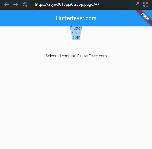
The SelectionArea widget in Flutter allows you to detect and handle selections made by users. It’s commonly used for implementing text selection, but it can be adapted for other selection purposes as well.
SelectionArea is a widget that creates an area that allows user selections. It can be useful if you want to make the widgets of a subtree selectable by the users. In addition to providing the selection capability, it also allows the application developers to customize the selection control and appearance.
Here’s a basic example of how to use the SelectionArea widget:
 import 'package:flutter/cupertino.dart';
  import 'package:flutter/material.dart';
  import 'package:flutter/rendering.dart';

  void main() => runApp(const MyApp());

  class MyApp extends StatelessWidget {

    const MyApp({super.key});

    @override
    Widget build(BuildContext context) {
      return const MaterialApp(
        title: 'Flutterfever.com',
        home: MyPage(),

      );
    }
  }

  class MyPage extends StatefulWidget {

    const MyPage({super.key});

    @override
    State<StatefulWidget> createState() {
      return MyPageState();
    }
  }

  class MyPageState extends State<MyPage> {

    String? _selectedContent;

    @override
    Widget build(BuildContext context) {
      return Scaffold(
        appBar: AppBar(
          centerTitle:true,
          title: const Text('Flutterfever.com'),
          backgroundColor: Colors.blue,
        ),
        body: SizedBox(
          width: double.infinity,
          child: Column(
            mainAxisAlignment: MainAxisAlignment.start,
            children: [
              SelectionArea(
                selectionControls: CupertinoTextSelectionControls(),
                contextMenuBuilder: (
                  BuildContext context,
                  SelectableRegionState selectableRegionState,
                ) {
                  return AdaptiveTextSelectionToolbar.buttonItems(
                    buttonItems: <ContextMenuButtonItem>[
                      ContextMenuButtonItem(
                        onPressed: () {
                          selectableRegionState
                              .copySelection(SelectionChangedCause.toolbar);
                        },
                        type: ContextMenuButtonType.copy,
                      ),
                      ContextMenuButtonItem(
                        onPressed: () {
                          selectableRegionState.selectAll(SelectionChangedCause.toolbar);
                        },
                        type: ContextMenuButtonType.selectAll,
                      ),
                      ContextMenuButtonItem(
                        onPressed: () {
                          // Other action
                        },
                        type: ContextMenuButtonType.custom,
                        label: 'Like',
                      ),
                    ],
                    anchors: selectableRegionState.contextMenuAnchors,
                  );
                },
                onSelectionChanged: (SelectedContent? selectedContent) {
                  print('Selected content: ${selectedContent?.plainText}');
                  setState(() {
                    _selectedContent = selectedContent?.plainText;
                  });
                },
                child:  Column(
                  mainAxisAlignment: MainAxisAlignment.start,
                  children: [
                    Text('Flutter'),
                    Text('Fever'),
                    Text('.com'),
                  ],
                ),
              ),
              const SizedBox(height: 50),
              Text('Selected content: ${_selectedContent ?? '-'}')
            ],
          ),
        ),
      );
    }
}output:

SelectionArea Parameters
Key? key: The widget’s key, used to control how a widget is replaced with another.FocusNode? focusNode: Focus node of the widget.TextSelectionControls? selectionControls: The delegate to build the selection handles and toolbar.Widget Function(BuildContext, SelectableRegionState)? contextMenuBuilder = _defaultContextMenuBuilder: Function to return a text selection toolbar widget when requested by the user.TextMagnifierConfiguration? magnifierConfiguration: Configuration for magnifier.void Function(SelectedContent?)? onSelectionChanged: Function to be called when the selection changes.required Widget child: The widget where the selection area is applied to.

