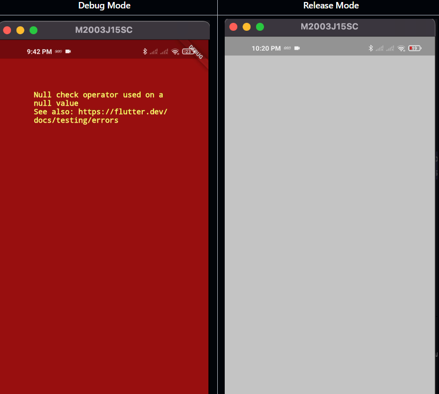
If you’ve developed Flutter applications, you’re likely familiar with the infamous red error screen in debug mode and the grey screen in release mode. But have you ever considered what this looks like to users? Seeing these error screens can be off-putting for users and may even affect how they perceive the quality of the app.

Here, we’ll explore how to replace the default error screen with a custom one, improving user experience and making your app feel more polished, even in the event of an error.
Step 1: Understanding ErrorWidget.builder
In Flutter, when an error occurs in the widget tree, the ErrorWidget.builder is triggered. By default, it displays the red error screen in debug mode, which provides debugging information. However, in release mode, it turns grey and is less informative. Fortunately, we can intercept this behavior and provide our own custom error widget.
Step 2: Creating the Custom Error Widget
To start, let’s create a simple custom widget that displays a friendly error message to users. This widget could include an icon, some text, or even a button to restart the app.
class CustomError extends StatelessWidget {
  final FlutterErrorDetails errorDetails;

  const CustomError({Key? key, required this.errorDetails}) : super(key: key);

  @override
  Widget build(BuildContext context) {
    return Scaffold(
      body: Center(
        child: Column(
          mainAxisAlignment: MainAxisAlignment.center,
          children: [
            Icon(Icons.error, color: Colors.red, size: 50),
            SizedBox(height: 20),
            Text(
              'Oops! Something went wrong.',
              style: TextStyle(fontSize: 18, color: Colors.black),
            ),
            SizedBox(height: 10),
            Text(
              'Please try again later.',
              style: TextStyle(fontSize: 16, color: Colors.grey),
            ),
          ],
        ),
      ),
    );
  }
}
Step 3: Overriding the ErrorWidget.builder in MaterialApp
Once the custom error widget is created, the next step is to override ErrorWidget.builder in your app’s MaterialApp. This will allow you to intercept errors and display the custom widget whenever an error occurs.
void main() {
  runApp(MyApp());
}

class MyApp extends StatelessWidget {
  @override
  Widget build(BuildContext context) {
    return MaterialApp(
      title: 'Flutter Error Page',
      home: const MyHomePage(),
      builder: (context, widget) {
        ErrorWidget.builder = (FlutterErrorDetails errorDetails) {
          return CustomError(errorDetails: errorDetails); // our custom widget
        };
        return widget ?? const SizedBox.shrink();
      },
    );
  }
}
Step 4: Testing the Custom Error Screen
To test your custom error screen, you can intentionally trigger an error. Here’s a simple widget with a deliberate error to test the custom error handler:
class TestErrorExample extends StatelessWidget {
  @override
  Widget build(BuildContext context) {
    return Text(
      null, // This will throw an error
      style: TextStyle(color: Colors.red),
    );
  }
}
so now
Important Tips:
- Design with Constraints: Remember to account for the space available on the screen, as you may not know where or when the error will occur.
- User-Friendly Messaging: Keep the error message clear and friendly. Avoid technical jargon to make it less confusing for non-technical users.
- Optional Retry Button: If appropriate, you could add a button that triggers a reload or takes the user back to a previous screen.


